
Look around today’s kitchens, and you’ll notice something unexpected: retro branding is everywhere.
Vintage cereal boxes, old coffee tins, and classic soda crates aren’t just tucked away in pantries—they’re proudly displayed. What used to be everyday packaging is now part of kitchen decor.
Why? Because these brands aren’t just products. They’re familiar. They’re nostalgic. And for many of us, they represent a sense of comfort that modern design can’t easily deliver.
Let’s break down how it happened—and why we’re still drawn to it today.

How Branding Moved Into the Kitchen (and Never Left)
In the mid-20th century, packaging mattered. A lot. There were no retargeting ads. No influencer unboxings. If you wanted someone to remember your product, you had one shot: the label.
So, brands went big.
Colors were bold. Fonts were playful. Logos weren’t minimal—they were maximal. Aisles looked like parades.
The goal was recognition. But the side effect? Familiarity.
These packages showed up again and again. On the shelf. In the pantry. In every grocery haul, on every kitchen counter.
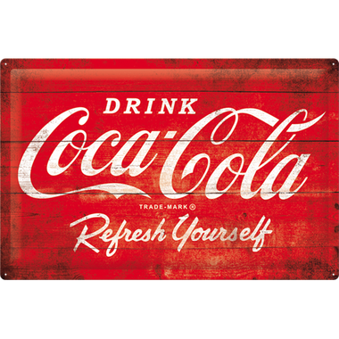
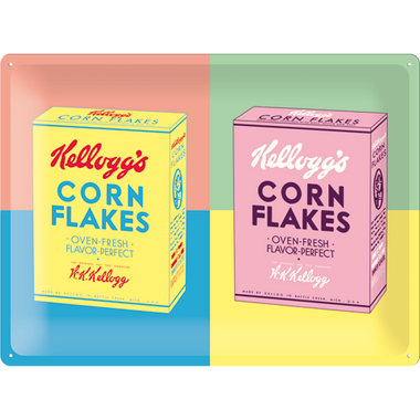
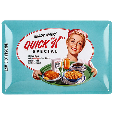
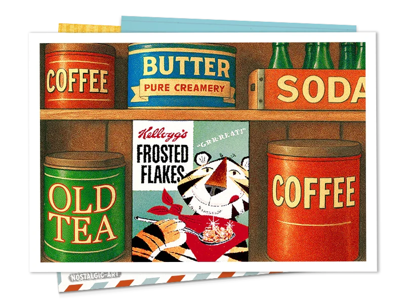
Over time, they became part of the backdrop of life. Not just “something we bought,” but something we lived with. Campbell’s soup cans. Corn Flakes boxes. Coca-Cola tins. These weren’t luxury items—but they became icons through sheer presence.
And once something becomes a fixture in the home, it starts to take root in memory.
What began as branding slowly turned into belonging. That’s how a cereal box became more than a cereal box.
We Remember the Cereal Box, Not the Cereal
What sticks with us usually isn’t the product itself. It’s the moment attached to it.
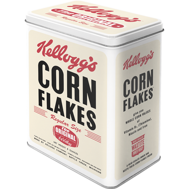
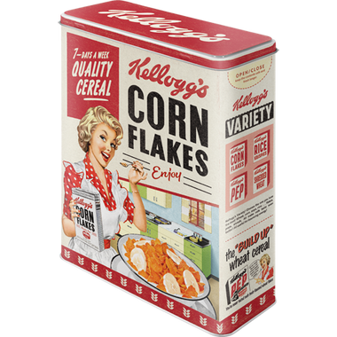
We don’t remember how Corn Flakes tasted in 1997. But we remember the box.
The feel of the cardboard. The sound it made when you closed the top flap. The rooster staring at you while you poured milk and read the back of the box for the 100th time. Not because you were interested in the “fun facts,” but because that’s what you did while you ate breakfast.
The cereal was average. The experience? Timeless.
Here’s what’s wild: branding becomes memory glue.
Even if we don’t care about design, our brains file away packaging like emotional shorthand. That yellow box wasn’t just breakfast—it was summer mornings, cartoons, your dad humming in the kitchen. It was stability.
Now imagine that memory multiplied by millions.
That’s the hidden power of pantry brands. They weren’t trying to be iconic. They were just there—reliably, gently, over and over again. Until they became something bigger than the product they held.
You see it in other places, too. Think about the classic blue-and-white Nivea tin your grandmother kept on her bedside table. Or that sturdy IKEA jug that's survived decades of family dinners. These things weren’t made to be beautiful. But over time, they became beautiful because of the memories and meaning we attached to them.
And in a weird way, we trusted them more for that. Because they didn’t change much.
Because they weren’t trying to be something new every six months. Because they aged in our homes like people do—familiar, faded in all the right ways.
So now, when we see a vintage cereal tin or an old soup can, something in us lights up. Not because of the design. Not because it’s rare.
But because it’s known. That kind of branding? It doesn’t just sell a product.
It sells a feeling. And that feeling stays long after the cereal’s gone.
Why We Kept the Tins
We didn’t always keep things because they felt nostalgic. Sometimes, we kept them because they worked.
Coffee cans were great for storing nails, sugar, sewing supplies, and whatever else needed a home. Butter tubs made surprisingly decent leftover containers. Jelly jars became drinking glasses before that was trendy.
In other words: reuse wasn't a trend. It was a default. These containers earned their second life not because we were sentimentally attached (at least not at first), but because they had utility.
But here’s the twist: usefulness created familiarity, and familiarity created affection.
That Folgers tin on the shelf? At first, it held coffee. Then pennies. Then crayons. Now it holds the kind of loyalty most modern brands would pay huge budgets to replicate.
And because we saw it every day, over and over again, it became part of the scenery. Part of the story. That’s the thing about repetition: it builds relationships.
The more something shows up, the less it feels like “just a thing.” The more it feels like part of your home.
And today, in a world of sleek, disposable everything, that kind of everyday reliability feels refreshing. We didn’t set out to keep these containers forever.
They just never gave us a reason to let them go.

From Branding to Aesthetics
Walk into a modern kitchen with a hint of personality, and what do you see?
A retro Coca-Cola sign hanging above the sink. A Hershey’s syrup can repurposed as a utensil holder. A Quaker Oats tin perched on a shelf like it belongs there.
And the thing is—it does belong.
What started as accidental decor has become an intentional aesthetic. People are decorating with the past, not out of irony, but because it feels right.
There’s something grounding about seeing a Campbell’s soup can next to a sleek, brushed steel appliance. The contrast doesn’t clash—it complements.
Why?
Because vintage branding has character. It’s colorful. Bold. Human. It carries the kind of visual warmth that modern design rarely dares to offer.
These pieces say something. Not just about taste—but about identity. A kitchen filled with loud, happy labels says:
I remember.
I don’t need everything to match.
I like things with a story.
It’s not a rejection of modernity—it’s a rebalancing act. A way to bring some soul back into our spaces.
And it works. Because people don’t just want clean lines and hidden handles.
They want texture. History. Familiarity.
So if a cereal tin makes you smile, that’s not kitsch. That’s comfort, cleverly disguised as corn flakes.
The Real Reason They Still Matter
We didn’t plan to love these objects.
We didn’t keep them out of sentimentality, or design sensibility, or because they “sparked joy.”
We just… kept them without question.
They remained, long after everything else changed.
They stayed because they became part of the household. Like a family recipe. Or a door that creaks the same way every time.
Now, when we see a familiar label from decades ago, we don’t think about the product. We think about the moment. The memory. The person we associate it with.
And in a world that moves fast, that kind of recognition is rare—and worth keeping.
The Folgers tin in the pantry? It’s not valuable. It’s not collectible.
But it’s known. And it’s yours.
Not because you curated it. Because you lived with it.
And that’s the quiet pop culture that doesn’t make headlines—it makes homes.